Descripción
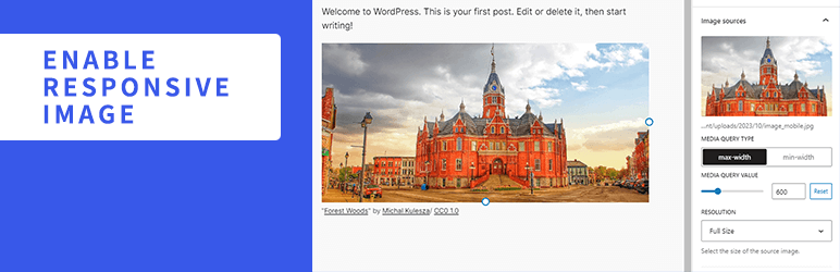
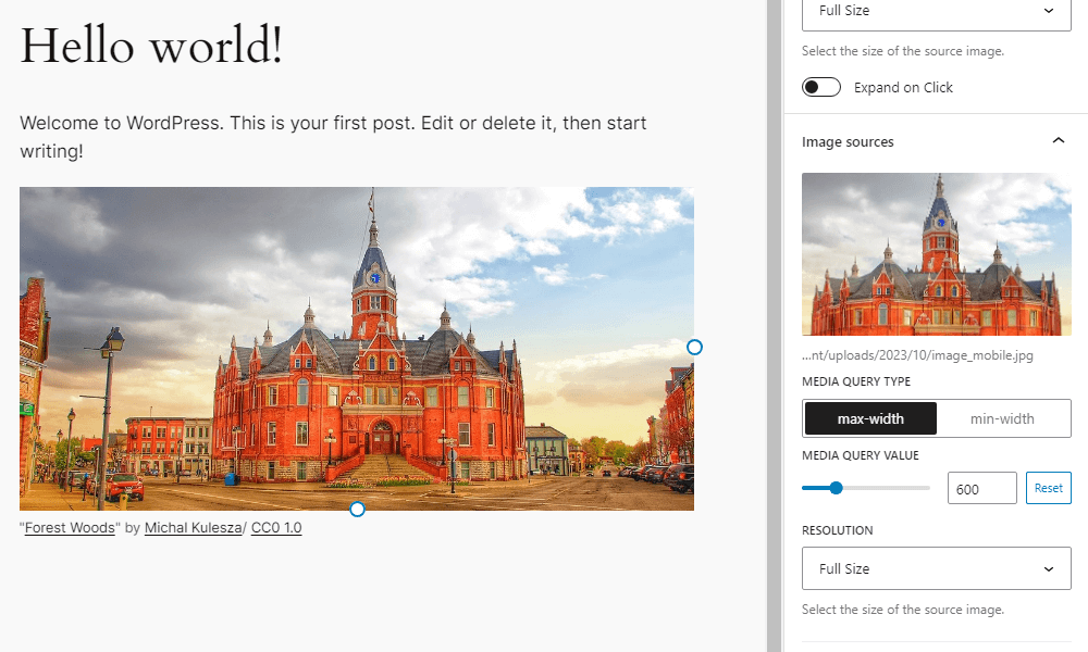
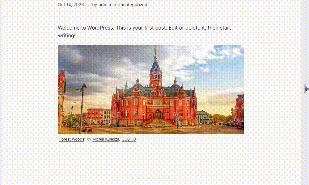
Enable Responsive Image adds settings to the Image block to display different images depending on the width of the screen. You can add multiple images and set media queries and resolution for each image. If the screen width matches the conditions of that media query, it will switch to the corresponding image.
Recursos
Imagen para captura de pantalla
- License: Public Domain
- Fuente: https://openverse.org/image/cd8e5cc5-d38a-462e-b4c1-1ea5c6f94e20
Capturas de pantalla
Instalación
- Sube la carpeta
enable-responsive-imageal directorio/wp-content/plugins/. - Activa el plugin desde el menú \’Plugins\’ en WordPress.
FAQ
-
¿Cómo funciona el plugin?
-
This plugin rewrites the HTML markup for the image block rendered on the front end. Wrap the img element with a picture element, and add source elements with srcset and media attributes inside the picture element based on the settings of the added image.
-
No funciona correctamente cuando se agregan varias imágenes.
-
Try rearranging the order of the images. For example, if both images have a Media Query Type of max-width, the one with the smaller value should be ordered on top.
-
Even if I switch the screen width or device on the editor, it does not switch to the set image.
-
On the editor side, images do not switch by default. Click the “Enable responsive image preview” button on the block toolbar.
-
¿Qué filtros puedo usar?
-
You can find a list of the available filters in the Github readme.
Reseñas
Colaboradores & Desarrolladores
“Enable Responsive Image” es software de código abierto. Las siguientes personas han contribuido a este plugin.
Colaboradores
“Enable Responsive Image” ha sido traducido en 4 idiomas. Gracias a los traductores por sus contribuciones.
Traduce “Enable Responsive Image” a tu idioma.
¿Interesado en el desarrollo?
Revisa el código, echa un vistazo al repositorio SVN, o suscríbete al registro de desarrollo por RSS .
Historial de cambios
1.6.1
- Security: Fix stored XSS by using validated media type in source tag
1.6.0
- Tested to WordPress 7.0
- Drop support for WordPress 6.8
- Mejoras en la barra lateral del bloque
- Accessibility: Improve source button aria-label
1.5.0
- Tested to WordPress 6.9
- Enhancement: Update block toolbar icon
- Drop support for WordPress 6.6 and 6.7
- Drop support for PHP 7
1.4.0
- Tested to WordPress 6.8
- Enhancement: Show full srcset url
- Accessibility: Respect user preference for CSS transitions
- Drop support for WordPress 6.5
1.3.0
- Probado en WordPress 6.7
- Dejar de dar soporte a WordPress 6.4
1.2.0
- Probado en WordPress 6.6
1.1.1
- Eliminar registro de cambios innecesarios
1.1.0
- Probado en WordPress 6.5
- Mejoras en la barra lateral del bloque
1.0.0
- Versión inicial